
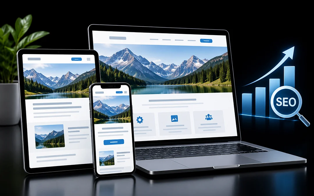
If your website is responsive to mobile but still does not perform well on a phone, requiring users to pinch, zoom, and scroll horizontally, you are losing more than an aesthetic. You are also losing search visibility. Responsive web design is one of the easiest ways to fix that, and its impact on SEO is far greater than many business owners know.
In this article, we will explain what responsive design is, why it matters to Google, and the seven ways it affects your rankings, traffic, and leads.
What Is Responsive Web Design?
Responsive web design (RWD) is an approach that enables a single website to adapt on the fly, according to the screen on which it is viewed. Using grids, fluid images and CSS media queries, the same page changes to fit a phone, a tablet, a laptop or a huge monitor.
The alternative is to have separate versions of a website, such as the desktop and an “m.” mobile site. This involves two sets of pages to update and two sets of URLs to manage, with twice the room for error. RWD replaces this complexity with one set of code and one URL per page.
Why Responsive Design Matters for Search
Most searches happen on mobile devices and Google has fine-tuned its algorithms to fit. Google’s mobile-first indexing policy prioritizes the mobile versions of your pages, so that they are ranked based on the mobile experience. When your mobile website is not on par (i.e. not optimized), it could impact your rankings in search engine results pages (SERPs) for mobile and desktop.
Google officially advises on using responsive design as the method for designing for mobile. Responsive design isn’t a direct ranking factor, but it is an underlying element of the majority of the factors Google considers when evaluating a website’s mobile-friendliness. Here are some of the reasons that responsive design continues to be a great option for mobile optimization.
1. It Aligns Your Site With Mobile-First Indexing
Mobile-first indexing refers to Google’s practice of crawling and indexing the mobile version of your content first. In the case of a responsive website design, the same content, headings, structured data markup, and internal links are used for the desktop version as the mobile version; nothing is left out.
With separate mobile sites, however, content is sometimes stripped down or structured differently or left without vital structured data or internal links. Google indexes the leaner version, and the rankings can suffer. A responsive design eliminates that risk since there is only one version of the page for Google to index.
2. It Improves Core Web Vitals and Page Speed
Page experience is a certified ranking factor of Google, and Core Web Vitals are its metrics. They measure three aspects of a web page: Largest Contentful Paint (LCP) which reflects the speed of appearance of the main content on the screen, Interaction to Next Paint (INP) which is the time between a user interaction and the next paint, and Cumulative Layout Shift (CLS) which is the amount of layout shifting that occurs while the page loads.
A great responsive website will positively impact all three metrics:
- Flexible images are available in different sizes depending on the device, thus preventing phones from downloading desktop-sized files.
- Consistent layout with dedicated space for images and ads, decreases layout shifts.
- A single, lean codebase avoids the redirects that separate mobile sites often need.
Bear in mind that responsive design in and of itself will not make your site fast. Large scripts, images, and slow hosting can hurt performance, but a responsive design will make it much easier to optimize the two.
3. It Lowers Bounce Rate
Suppose you click on a search result on your phone, and you end up on a page with the smallest text, buttons that overlap with each other, and a menu you can’t use.Now suppose you click on a search result on your phone, and you wind up on a page that has the smallest font, overlapping buttons, and a menu you can’t use. After a couple of seconds, most people would leave and go back to the search results to look for another search.
A responsive layout prevents this by giving the visitor larger text, buttons that can be tapped with a finger, and a menu that appears on a small screen. Google isn’t going to penalize you for having a high bounce rate, but the fact that people are leaving your page and returning to the search results means that something is wrong.
4. It Improves Usability and Time on Site
Good usability transforms site visitors into customers. On a responsive website, users manage to read your content, compare services and fill in an application form or call our company without struggling with the interface.
As a result, they stay on your site for a longer time, visit more pages and become engaged. This engagement boosts the conversion rate and drives traffic to your site through returning visitors and brand queries.
5. It Avoids Duplicate Content and URL Problems
Having two separate sites for desktop and mobile versions of your platform may lead to having the same content but on different URLs. You need to make sure to add canonical tags, alternate annotations and redirects to avoid having search engines penalize your page for duplication. Responsive design doesn’t have these issues, as there is only one URL for the page.
All the backlinks, social media mentions, or any other promotion you do will positively affect the same page, increasing its authority and search ranking. It also makes the maintenance of your site easier, as you only have to make changes on one page and both versions of your site will update.
6. It Makes Crawling and Indexing More Efficient
Search engines only have a limited amount of budget (resources) to crawl each site, so how well your pages can be crawled is particularly important for large sites. By using a responsive design, Googlebot only needs to crawl one version of each page rather than mobile and desktop versions.
This means that new and updated pages are typically discovered and re-crawled quickly. It also makes technical SEO tasks such as XML sitemaps, hreflang tags and structured data easier since everything lives on one URL. Fewer moving parts means fewer opportunities for things to go wrong during indexing.
7. It Encourages Sharing and Earns More Links
Most users who read an article or product description on your website from their phone are going to share it somewhere from the same device. If your page isn’t easy to read on mobile, you’re losing out on people passing along your content. Making sure you have a mobile responsive site will make sharing your content much easier, and the new readers you get from those shares could help your site’s SEO.
When someone shares your content on their social media or sends it to a friend by text, it makes it easier for other bloggers, journalists, and website admins to find and share your content too. Although social shares don’t directly affect your search engine ranking, the traffic and backlinks that these can generate will have an indirect effect on your search engine ranking.
Common Responsive Design Mistakes That Hurt SEO
Going responsive is not enough on its own. Watch out for these frequent problems:
- Hiding content on mobile. Since Google indexes the mobile version, anything you remove for small screens may be treated as if it does not exist.
- Blocking CSS or JavaScript files. Googlebot needs them to render your page and confirm that it is mobile-friendly.
- Oversized images. Uncompressed images slow down mobile pages. Use modern formats like WebP and responsive image attributes.
- Tiny tap targets. Buttons and links placed too close together frustrate users and can trigger mobile usability issues.
- Missing viewport tag. Without the correct viewport meta tag, phones may display a shrunken desktop layout.
How to Check Whether Your Site Is Ready
You do not need special tools to get started. Try this quick audit:
- Open your key pages on a real phone and a tablet, not just a resized desktop browser.
- Run your main URLs through Google PageSpeed Insights to check Core Web Vitals on mobile.
- Review the Page Indexing and Core Web Vitals reports in Google Search Console for mobile issues.
- Compare the mobile and desktop versions of a page to confirm the content, headings and structured data match.
- Test your forms, menus and checkout or contact flows with your thumb, not a mouse.
If you find problems, the fix usually goes beyond a few CSS tweaks. It can involve rethinking layouts, image handling and how scripts are loaded, which is where an experienced web development team makes a real difference.
Build a Site That Works for Every Screen
Responsive website design is fully integrated into the modern SEO practices: mobile-first indexing, speed, engagement, easy navigation and shareability, and overall improved UX which ultimately drives conversions and ranks. Responsive design also protects the client’s investment: one easily maintained website is significantly more valuable than a set of separate mobile and desktop sites. With the help of responsive web design, Technoz Software can create a website that is easily crawled by Google and appreciated by the users. We will take care of your website’s technical SEO on an ongoing basis. If you suspect that your website is not performing well on mobile, contact us and we will take a closer look.