
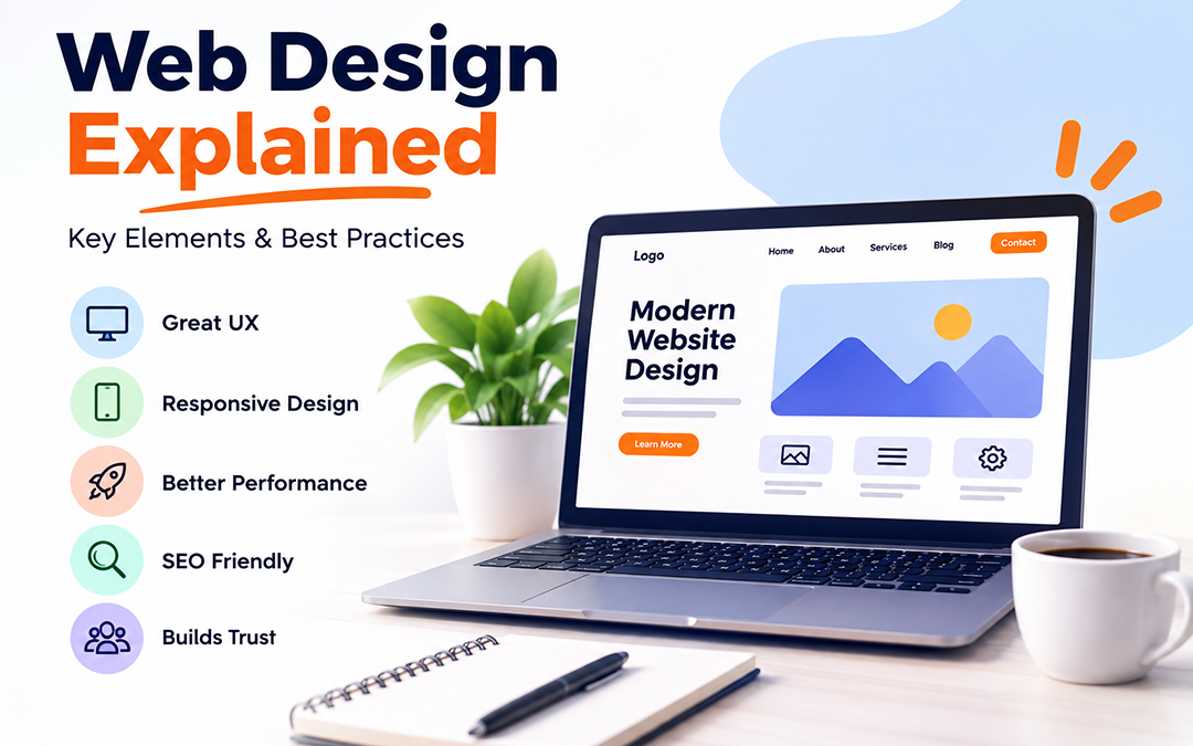
What Is Web Design?
Web design is the process of designing the layout, arrangement, and building of the content of the website along with the design of graphics. It also has to do with how websites are presented, both aesthetically and to the users they are designed for. The design of any website should help the visitor get a clear view of the purpose of the website, understand how to use it, and locate the information he or she is seeking.
It’s then important that the website design is attractive and functional, fitting the needs of the different devices and platforms used. It should also be user-friendly, efficient, search engine optimized, and easy to access. A good and effective website design can be helpful to your company because it can assist to boost your brand name in search engine results, capture your visitors, and give your website a better online appearance.
5 Benefits of Good Web Design
- Develop your brand personality. The design of a website can help establish your brand identity and create a positive initial impression with your audience.
- Improve user experience. Your site will be easy to navigate, making it easy for your customers to find what they are looking for.
- Increase visibility. The design of your website will influence its ranking in a way that will make you visible to many who would want to find you online if you have it set up properly.
- More Leads. The websites that are designed well can help you to attain better conversion rates. That equates to more sales, more bookings, more leads, and so on.
- Establish Credibility. Customers will judge you more favorably and see you as professional and credible if you have a modern and well-designed website.
Web Design vs. Web Development: What’s the Difference?
Web design refers to the designing of the appearance of the website. It includes the structure, color palette, graphics, images, navigation, and UI and UX elements of the website. Web Design is basically about the quality look and feel of a website with regards to an average customer. Web design also has to do with branding and the entire impression of the website as a whole, which will carry the brand message.
However, web development involves coding and web page development. It is related to web page developers and practices that they use to create the working web pages. To make the web pages functional and interactive, there are many coding languages used by developers, among which HTML, CSS, JavaScript, and many others are used. To conclude, web developers deal with making websites while web designers make them look nice.
The 5 Fundamentals of Effective Website Design
The most important thing about a successful website is to make it aesthetically pleasing and provide value to the users on the site and off the site. Additionally, it needs to be user-friendly and responsive on a range of devices. These 5 fundamentals are crucial to create a website that will resonate with customers and meet the goals of the organization.
Content
Content is one of the most important factors of any website; it provides the primary information on the products/services you are offering and the company itself. So, the beauty of the visuals, the quality of the text, the relevance of images, and the effectiveness of the calls-to-action need to be enhanced to respond to the customers’ questions and motivate them to take action.
Layout
The right layout can help your reader navigate the information you are presenting and keep him/her focused. The content should be structured in a clean layout that can be scanned.
Navigation
The way the website is navigated should allow the website visitor to navigate from one page to another easily. Use informative titles, categories, internal links and other resources to help your visitors not spend too much time looking for information on your site.
Visual style
Your website graphics should be attractive and your website should be a reflection of the brand in a manner that will be pleasing to the eye. Your colors, fonts, and images should be aesthetically pleasing, used correctly, as well as other graphics which should be used and the layout of the graphics should be pleasing and lead the eye to the area of content you want it to go.
Function
A website should look good but also be efficient and have good-quality content, be fast-loading, be responsive to users on the screen and mobile, have working forms, be accessible to people, and have functioning buttons. A technically efficient website will create an environment that will cause a person to return to the site, enabling them to obtain the information they need to accomplish tasks that will benefit a business.
Web Design Best Practices
There are several web design best practices to keep in mind when creating and designing a beautiful, intuitive, and engaging web page:
- Design for your users. Understand your audience and their needs. This information is of great importance, and it’s worth making the effort at this time. The wisdom you pick up in this step can be the foundation of your terrific site.
- Opt for mobile first. Today, the majority of people that use the Internet do so on a mobile device. When you’re a designer, you’re aware of the vast majority of your site visitors come from small screens, and that’s a reality you must live with. A high percentage of traffic is from cell phones. When you are among those who use mobile devices to navigate the web, think about the effect that your design will have on them.
- Apply responsive web design. Make sure that your pages are smooth and responsive to the screen and device that your users are using. You will be able to serve your content better because all the people can view it conveniently.
- Grab your users’ attention. The strength of your website is that you can provide video, animation, graphics and interactive elements that will keep users engaged. At the same time, you need to use these features to draw attention to the important parts of your content.
- Design for readability. Ensure text has a good contrast and size to aid in readability. It is advisable to highlight important text by making it stand out. Also, with white space, let the content breathe so that the users can navigate through the content.
- Boost SEO Now that your website is mobile-first and responsive, make sure that the content on your website is easily accessible and shareable. Your content will then be indexed quicker by the search engines, and your content will show up in the search results. Meanwhile, your site visitors will enjoy your content and value your site.
- Test and tweak. Run a number of tests to uncover blockages and challenges your users may experience while navigating your site. This step is vital as it offers you a chance to improve your design before working on the coding. To make a small change to the design instead of fiddling with the back-end code and finding out that the buttons don’t work is always better.
Responsive vs. Adaptive Design
When developing a contemporary website, it is crucial to choose the best method to adapt the website’s content to different screen sizes. There are two popular methods when it comes to making your website accessible and easy to use for all clients, no matter which Internet gadgets they are using to browse the Web. These are responsive and adaptive designs. While the two are alike, they have basic differences, and so one is more suitable for particular projects than the other.
What is Responsive Design?
Responsive design is a flexible methodology that makes it possible to show an appropriate display and optimal readability of websites to all users who access the site from various gadgets. It works on the principle of fluidity, which means that web pages will change their structure of content depending on the screen resolution. The design elements are not fixed, allowing them to be displayed on any screen with images, text size, number of columns, menus, and buttons. It’s ideal for websites that reach out to a wide range of devices.
For instance, a three-column website on the desktop will be reduced to a single column on a mobile phone. The information remains the same but is presented differently for the smaller screen.
What does Adaptive Design mean?
Another popular method to create a website that is comfortable to use on various gadgets is the adaptive design. Adaptive design is different from responsive design in that it has a set number of pre-defined layouts for specific screen sizes. The sites that implement this concept can recognize the resolution of the display and select the most appropriate layout of the following selected layouts. For example, adaptive design may have three different layouts for the desktop, tablet, and mobile versions of the site. Every layout is designed to yield the greatest user experience of viewing and interacting with the layout on a specific device.
Adaptive design can be useful for companies that would like to get more control on how their website appears on various devices. It also serves to keep the website’s quality as far as multiple screen resolutions are concerned.
What’s the Difference between Responsive and Adaptive Design?
The primary difference between responsive and adaptive design is that the former is fluid and adaptive design uses multiple fixed layouts. Thus, responsive design can be applied to all screen sizes, as it has a flexible structure that allows it to adjust to the resolution of the viewer’s device. Adaptive design, on the other hand, isn’t fluid and thus has several layouts to accommodate the different screen sizes of the gadgets its viewers use.
Adaptive design is more rigid and more difficult to maintain than responsive design. On the contrary, adaptive design provides more control over the layout and display of the website. Responsive design vs adaptive design is a matter of the type of site and the business owner.
Which Design is Better for Websites?
Responsive and adaptive designs are suitable for the creation of modern websites. But their pros and cons should be taken into account before selecting one of them for the website project. The most successful approach is responsive design, which can be flexible and optimal for any screen resolution, making it the best way to build most websites. It’s not difficult to maintain, with just one layout that is changed to fit various screen resolutions. Therefore, responsive design is ideal for websites that cater to a large number of users who use various gadgets.
Adaptive design can have a positive impact on websites that have specific needs and have to show the best website to all of their users. It is a good choice for businesses that want to have more control over their website’s appearance and user experience. But adaptive design takes more work and time to keep up with, as there are multiple layouts that need to be updated. This is suitable for websites that have certain requirements and need to display the best for all their viewers.
Why is Responsive Design Good for SEO?
A responsive design is useful for search engine optimization (SEO) since it offers a flawless experience for every viewer of a website, irrespective of the gadgets they utilized. For all websites, SEO can play a vital role in making the website visible to the search engine results, which makes it easier for the people who are interested in using the services of the website to get through the website. A responsive design helps to achieve higher SEO performance as it provides a better experience for the users, which search engines value. Moreover, it allows search engines to easily access and index the website’s content, making it more relevant in the search results. This means that websites aiming to boost their SEO can find it more beneficial to employ a responsive design.
But, it’s important to mention here that responsive design is not enough for a better SEO score. The content of the website should also be optimized and technical aspects of the website should be enhanced to make the website search engine friendly.
Below are a few tips for creating a responsive website.
There are various best practices to follow to create a responsive site. One of the most important is to employ fluid layouts that enable the website to fit the screen resolution of the viewer. Secondly, optimizing the images is very important to ensure that they are properly displayed without slowing down the website. Next, a website that is responsive should also be mobile-friendly so that the viewers can easily navigate through the site.
You need to select a suitable font size and line spacing so that the content can be easily read on all gadgets. Fifth, website buttons need to be big enough to be pressed without any problems. Sixth, you should test the site across diverse devices to make sure that it looks good on each device. Last but not least, there should be no elements on the responsive website that slow it down, particularly on mobile devices.
Which is better, Responsive Design or Adaptive Design?
Responsive design has its pros and cons, and so does adaptive. Hence, it is vital to select the one that will suit the particular requirements of the site. Responsive design is more flexible, and it is easier to maintain, but adaptive design offers more control over how the website will be shown. The ultimate goal of responsive or adaptive website development, however, should be to offer the best user experience for the website viewers.
When it comes to creating a website, having a good website design is crucial for attracting visitors and communicating your message and/or call to action to them. The user experience encompasses a variety of aspects, including content, layout, navigation, aesthetics, and more. Professional appearance, speed, accessibility, mobility, user-friendliness, and search engine optimization are essential for a website. By applying SEO best practices and regularly updating and maintaining their website, a business can boost their online presence. A website helps satisfy customers’ needs and accomplishes the company’s objectives.