
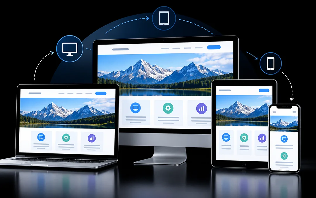
Have you ever tried to view a webpage on your smartphone and had to constantly pinch and zoom the screen to read each sentence? That is the experience of a non-responsive website.
Responsive web design is one kind of website coding that makes the website adjust according to the device that it is viewed in. All images, paragraphs and page layout adjust to fit the screen of a phone, tablet and desktop monitor. The vast majority of website visitors are using mobile devices, so such an adaptive design is now more than required for websites.
In this article, you will learn:
- Why responsive design matters
- Popular frameworks for building responsive sites
- The core components of a responsive website
- Real-world examples
- A practical workflow for designing responsively
Why Does a Responsive Website Matter?
- Visitors have a better experience. Pages that fit the screen, load quickly and are simple to navigate help retain the visitors’ attention. The person who had a great first impression on a phone has a much higher chance of returning to a website.
- Your team works more efficiently. With one responsive site, you can update the content in one place, and it will update throughout the site. Developers can also update the code for one website, rather than having to update multiple versions for different platforms.
- It supports better conversions. By keeping the same layout and design, your website visitors can navigate through your website on different platforms and know that they will find what they are looking for and how to get there whether they come from desktop or mobile.
- It improves accessibility. Responsive design allows building sites that are accessible to more users because clean HTML code is easier to parse by screen readers and other devices.
- It lowers costs. It is much easier to maintain one site than to manage two separate ones (desktop and mobile). This saves both time and money.
- It helps your SEO. Google prioritizes mobile-friendly sites in its search results. A responsive design also provides a better user experience and faster download speeds, which in turn improves the site’s ranking and visibility.
Responsive Web Design Frameworks
You don’t have to start from a blank page. These frameworks come with ready-made grids, styles, and documentation:
| Framework | Best For | Key Strengths |
|---|---|---|
| Bootstrap | Fast builds and pre-made components | Ready-to-use grid, navbars, and UI pieces with built-in responsive classes |
| Pure CSS | Small projects and lightweight pages | Minimal footprint and full control over styling |
| Foundation | Complex, feature-rich sites | Flexible grid, Sass mixins, JavaScript components, strong accessibility focus |
| Semantic UI | Readable code and accessible interfaces | Theme-based customization and human-friendly class names |
| jQuery | Adding dynamic behavior alongside other tools | Simple DOM handling and a large plugin ecosystem |
| Tailwind CSS | Highly customized layouts | Utility classes with breakpoint prefixes for precise control |
A few notes on each:
- Bootstrap is probably one of the most popular solutions. The library’s grid and components allow for rapid prototyping and development of prototypes.
- Pure CSS is lightweight and does not impose opinions on you. This approach implies that you will have to write more code, but you will have more flexibility and control.
- Foundation is suitable for more significant projects because it provides off-canvas, reveal, and visibility classes for hiding and displaying content on screens of different sizes.
- Semantic UI prioritizes accessibility and uses Flexbox for the grid. The library also provides readable code and relevant HTML components.
- jQuery is technically not a CSS framework, but it allows you to achieve a considerable number of features using only JavaScript code. jQuery is often used in conjunction with other CSS frameworks, such as, for example, collapsing mega-menus into hamburgers at narrow screen widths.
- Tailwind CSS functions much like previous, by enabling you to manage items directly in the markup. It is much more extensive and customizable, however, so it is great for larger projects. Responsiveness can be obtained with classes that are responsive to the screen size, depending on the width of the screen.
The right answer is based on the size of your project, your team ability and the degree of design freedom that you want.
The Key Components of Responsive Website Design
Responsive behavior is determined by HTML, CSS, and JavaScript. In particular, these technologies’ five components are involved in the process.
1. Flexible Layouts
A responsive layout allows the page structure to be changed and reorganized when the screen size changes by stretching, shrinking, stacking, or hiding elements. Two of the most popular approaches to building such a design are CSS Grid and Flexbox.
CSS Grid is well suited to page-level structure. This snippet creates columns that automatically fit the available space:
.card-grid {
  display: grid;
  grid-template-columns: repeat(auto-fit, minmax(240px, 1fr));
  gap: 20px;
}
Flexbox works best for arranging items inside a container, controlling their order, spacing, and how they share room:
.row {
  display: flex;
  flex-wrap: wrap;
  gap: 14px;
}

.row > .item {
  flex: 1 1 220px;
  min-width: 160px;
}
Grid handles the big picture, and Flexbox handles finer alignment. Most modern websites use both.
2. Media Queries
Media queries apply styles under specific conditions such as a screen resolution or a particular width or height of the screen or device orientation (portrait or landscape). It is possible to change font size, restyle menus, reorder sections and hide some elements on small screens using media queries.
@media (max-width: 640px) {
  .promo-banner {
    display: none;
  }
}
Here the promo adapts to 640px or smaller screens. The majority of projects include multiple such rules at various breakpoints.
3. Responsive Navigation
A well-designed menu for a desktop device might not work as well when displayed on a mobile device. A responsive navigation, on the other hand, resolves the issue by arranging the links in a hamburger menu, an accordion list, or a tab group.
<nav>
  <button class="menu-btn" aria-label="Open menu">☰</button>
  <ul class="menu">
    <li><a href="/">Home</a></li>
    <li><a href="/about">About</a></li>
    <li><a href="/services">Services</a></li>
    <li><a href="/contact">Contact</a></li>
  </ul>
</nav>
.menu-btn { display: none; }
@media (max-width: 768px) {
.menu { display: none; }
.menu-btn { display: block; }
}Add a little JavaScript to toggle the menu when the button is tapped, and mobile visitors get a clean, usable navigation.
4. Responsive Images and Video
Oversized media is one of the most frequent instances of failure to display a layout on mobile. The easiest solution is to prevent images and videos from oversizing their container:
img,
video {
  max-width: 100%;
  height: auto;
}
The max-width: 100% rule is used to ensure that the media remain within the container, and the height: auto rule will maintain the original proportions. Smaller rendered images may also assist in faster loading times on pages. Serve files that are appropriately sized for best results, not just using scaling.
5. Responsive Text
What’s pleasant to read on a desktop may be quite small on a cell phone, or very large. You can use media queries or media units (vw, vh) to change type. The CSS clamp() function is frequently the easier one to use because it establishes a minimum, a preferred and a maximum:
h1 {
  font-size: clamp(1.5rem, 5vw, 3rem);
}
The heading never gets smaller than 1.5rem or larger than 3rem, and in between it scales smoothly with the screen width.
Responsive Website Examples
Here are three types of sites that handle responsiveness well.
- A restaurant website. The essentials sit at the top on every device: address, opening hours, and a reservation button. The menu follows below. The most important information stays easy to reach, whatever the screen size.
- A fashion or lifestyle site. Photography leads the page. On desktop, images fill a spacious grid, and on mobile the grid becomes a tidy single column of large, tappable tiles for each category.
- A vocational rental site. Large graphics and adequate white space maintain the page’s high quality. The layout remains unobstructed on smaller screens, allowing the pictures to sell the home.
In all three, the pattern follows the same rules. PRIORITIES ARE CLEAR, CONTENT REFLOWS SENSIBLY, AND LOOK CONSISTENT ON DESKTOP, PHONE.
A Simple Responsive Design Workflow
Whether you’re starting fresh or fixing an existing site, this process works well.
- Step 1: Set breakpoints. Determine the widths of screen sizes you want to design for, usually phone, tablet, desktop and anything in between where it’s beginning to feel a bit strained.
- Step 2: Create designs for each size. Create layouts for each breakpoint in your design tool. Employ flexible layout rules like auto layout and constraints to ensure predictable resizing of elements, and create reusable components like buttons, cards and headers to keep them consistent across all layouts.
- Step 3: Pass to “development”. Leverage developer handoff tools and/or code-generation plugins, if applicable, to enable faster transition from design to code. Always check generated code for quality and performance.
- Step 4: Test and improve. Be sure to test your work in browser developer tools, responsive testing tools, and device simulators, and on real phones and tablets. Check if they have a seamless transition, easily readable text, easily tappable buttons, and navigation that is functional at any size.
A responsive website is the basis of a good user experience. Flexibility, media queries, adaptive navigation, scalable media, and fluid typography allow a site to look and perform good on any device, and only one version must be maintained.
If you are planning a redesign or new website and want to do it right, a professional web design team can create a responsive website for you that looks great and functions well on all screen sizes.
Responsive Web Design FAQs
How does responsive design affect SEO?
What are the three essentials of responsive design?
- Fluid grids that use relative units like percentages instead of fixed pixels
- Flexible images that scale inside their containers without distortion
- CSS media queries that change styling by screen size, orientation, or resolution
Responsive text and navigation are also key parts of a strong system.
What's the difference between responsive and mobile-first design?
It is a fluid approach which allows the site to respond to different screen sizes, but mobile-first is about designing for the smallest screen first and then adding onto it for bigger screens.
How can I test whether my site is truly responsive?
You can do it all: resize a browser, use developer tools, test on device emulators, check with online responsiveness checkers, and test on real devices to make sure that everything will look good at each breakpoint.
What mistakes should I avoid?
- Text that’s too small to read comfortably
- Buttons and links that are hard to tap
- Cluttered layouts on small screens
- Heavy images that don’t scale or load slowly