
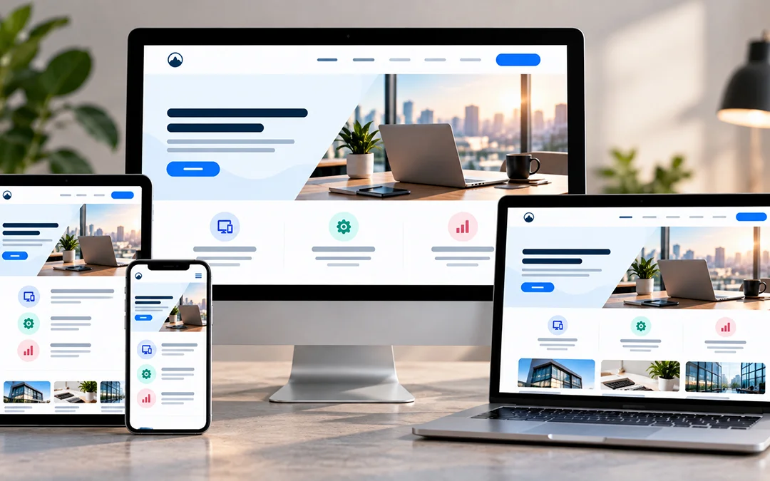
Go to your site on your cell phone now. Then on a laptop. If one looks bad, such as tiny lettering, or a button that you’re consistently missing with your thumb, your customers are having the same problem. Most won’t tell you. They’ll just close the tab.
That’s what responsive web design is all about. Your website should be usable on any screen that anyone may be viewing. We receive a lot of inquiries about this at Technoz Software, typically from a business owner who realizes his/her site is great in the office, but not so hot on their mobile device.
So, here’s the good stuff: what responsive design is, why it’s worth the effort, how to do it, who does it well and what to avoid.
What is responsive web design?
Responsive site changes to fit the device. It measures the width of the screen and does the same if the phone is held sideways or upright and adjusts the page accordingly. No Pinching No Zooming No Sideways Scrolling.
The layout doesn’t need to be the same at all locations. One column for a phone and several columns for a desktop. The important thing is that the page is readable and usable on both.
It’s also easier on the team you’re on. One site, one codebase. You’re not running a separate mobile site which lags behind all the time.
And people are out there on their mobiles. Over 60% of the web traffic is from phones and tablets, so if your site appears good on a desktop but not on a phone or tablet, you are missing out on the majority of your visitors.
How to use breakpoints.
A breakpoint is simply a place where your layout changes. You know what it is like. You have narrowed down your browser window, and three of them will suddenly be one. The breakpoint is the jump.
Most sites will have a couple, typically one per device category: phones, tablet computers and desktops. Typically layouts are designed around four column layouts. Typically, it’s arranged this way:
- Extra-small: phones, up to about 500px, 4 columns
- Medium: 500px to 1200px, 8 columns, tablets
- Topic: about 1200px to 1400px, 12 columns, using laptops
- Large: big monitors, 1400px and up, 12 columns
Don’t take those numbers as holy. Consider your own site. Where a layout becomes awkward at 900px, add a breakpoint at 900px. The breaks should be indicated in the text, not a chart.
Benefits of responsive web development.
There are three large winnings involved. Visitors enjoy it more, Google enjoys you more and the business benefits.
User experience (UX)
No one likes to pinch and zoom the page to read it. If a site is a pain on their phone, people leave and usually don’t come back. Even those who remain may not get to see the important part, if it was buried behind a shoddy layout. That will lead to lost enquiries and sales, and increase your bounce rate.
SEO
Google’s ranking of sites includes a part that is based on performance on mobile devices. Not having the same content duplicated on separate mobile and desktop versions of your site is also avoided with a responsive site; all your content will be on the same URL per page. If you are interested, we went over this in our blog post when we discussed the benefits of responsive web design for your site’s SEO.
Business impact
One site is less expensive to operate than three. Combine that with more satisfying visitors and higher search rankings and you’ll most likely receive more leads out of the same traffic.
Responsive web design techniques and methods.
You can’t press a button here. It’s a handful of techniques used together. We go deeper in our article on the key components of responsive web design, but here’s the short version.
- HTML and CSS: HTML contains the content and CSS deals with the appearance. They work together to resize, hide or rearrange just about anything you want.
- Media queries: These are rules that are only activated when certain conditions are met, such as a screen being smaller than a certain width.
- Layout: Fluid layouts are based on percentages, that make things scale with the screen. Flexbox allows your items to shrink or expand to fill the space or to avoid overflowing.
- Responsive images: Responsive images are implemented to make them fit inside their container – so if you have a big banner on a small screen, it won’t wreck the layout.
- Speed: Slower pages are lost. Squeeze out all that slows down the display of your images, compress them and clear the cache.
Responsive web design examples.
Companies such as big brands have already done a lot of this work, which is why it is worth taking a look at what they have accomplished.
The New York Times
The Times website was revamped around 2018 to be faster and more consistent. By now their app was like a newspaper but the desktop site lagged behind. This required a change to make the same reading experience no matter where the book was opened.
Dropbox
Dropbox’s mobile and desktop pages are very close. The differences are minor, primarily spacing, colour and font sizes, enough to not make it hard to read on a slender screen.
Etsy
You’ll get a cluttered header on the laptop with many options. With a phone, that all goes away, and the products get in. It makes sense. People on the phone don’t want to see menu options, they want to see things.
GitHub
The design is definitely a show of GitHub’s desire that you sign up. You’ll receive product information on the right of a sign-up form on desktop. On mobile the additional content is removed, and the primary focus is signing up.
Slack
On smaller screens, Slack displays its navigation in a hamburger menu, and reduces the number of buttons. Two calls to action pop up as one big easy-to-tap button on mobile. The content too is positioned in a single column.
Starbucks
Starbucks does it the basic way, no fancy effects and large, seasonal photos. There’s one small problem though. The product menu is easy to find on desktop, but not so easy on mobile, where users may not suspect to look here.
Responsive web design best practices.
Here are some of the things we would tell any client who is beginning a responsive project.
Prioritize content.
Prioritize content.
Mobile users do not like to search. Place the vital information at the top and make pages easy to skim. If you don’t change the text and images size on a page, then it will load slowly on a phone screen if it was long on a desktop screen. Identify what you want to convey and ensure that it’s the first thing people see.
Reduce friction.
Think about why the page was created. A purchase? A booking? A contact form? Surround that one thing and eliminate the elements that detract from it. If there are too many buttons, it leaves people confused.
It’s easier to design for mobile first, as it forces you to be selective. If the primary goal is successful on a phone, then you can easily add on additional content later on larger screens, such as a newsletter sign-up. But be sure not to take center stage.
Think about thumbs.
Phones are in my hand; thumbs don’t reach that far. The upper part of the screen is the most difficult area to access and that’s where desktop menus are typically found. Place frequently-used buttons within easy reach of a thumb and ensure they are large enough that users can’t press the wrong one.
Design and develop together.
Designers and developers should communicate from the beginning and not after the design is completed. Designers determine movements of content. Developers know what’s feasible to construct. Combined you’ll get greater readability, longer visits, smoother interactions and more online sales.
The process is so simple. Start collecting, sketch the structure, create pages and test a beta before launch.
Make it structural.
Do not improve responsiveness of one page. Use it as part of the components that your pages are composed of such as cards, carousels, banners and buttons. Once you get each of those working for the various screen sizes you get them for free on new pages. Your team can focus on content, without having to rebuild layouts.
Test repeatedly.
Testing isn’t a one-time thing before launch. Test navigation with the changes in the screen. Test your fonts on multiple devices as a font that works on one device may look like gibberish on another. Check your analytics and test on those browsers and devices that are actually used by your visitors. And monitor load time, particularly when pages contain lots of images and videos.
Create your own responsive websites.
The process of rebuilding does not need to be done all at once. Choose one page that’s important, such as your home page or your primary page for a service. Before you design, think about what it should do and design for the small screen first and then work up.
If you prefer that someone else does it, that’s what we do as well. Technoz Software creates responsive websites for Surrey and the Lower Mainland businesses. Give us a call and we’ll see what we can do for your site.
FAQs
What are the 3 basic things required for responsive web design?
Most of the work is done by three things:
- Media queries: These are the rules in CSS that are applied to the styles according to the screen size, resolution, or the device.
- Flexible grid layout: A grid size that is based on percentages or relative values that will resize columns and spacing based on screen size.
- Fluid images and media: Images and video that fit within the container without overflowing.